


Next.js <Image /> Component and Image Optimization


Hey everyone, I hope you're doing well and you keep learning, practicing, and getting one step closer to your goal. It's been a while since my last post. I was busy with life and learning. Sometimes trough of sorrow hits you when you expect it the least 🫡.

I have been learning and practicing Next.js. It is a flexible React framework that gives you building blocks to create fast web applications. It has a bunch of cool features just out of the box. Instead of speaking about all of these, I will focus on one feature that I find very cool and makes your web application much faster.
For those who want to learn more, Next.js has incredible documentation. You should definitely check it for more details.
Our topic will be Next.js Image component and overall how we should implement images in our websites and web applications.
The Next.js
Imagecomponent is an extension of the HTML<img>element
Before talking about the Image component, we should first talk about images though.
The images are one of the biggest contents of a website. We add them to:
- give the user a better user experience,
- visually attract attention,
- help the user understand the content better,
- guide your visitor's line of sight.

So not using them correctly might cause our website to slow down drastically. And in a world where everything moves fast, people wouldn't probably wait for our websites to load for 10 seconds.

Optimize Images
- Use the correct size images according to device width. For desktop, you might use a 1920x1280 picture. But using the same size picture for a mobile device that has 375px device width will unnecessarily slow down your site.
- Use the correct format for your images. What is suggested is that using
Webpformat since its quality is the same as usingjpgorpngformat but it's less heavy.WebP is a modern image format that provides superior lossless and lossy compression for images on the web. It's supported by most browsers. Check here.
- If you're using lots of pictures on your site, you might want to add
loading="lazy"attribute to your<img />element. So the browser won't send any requests to download more resources as long as the users don't come into view. This will lead to a performance boost and load your site faster since the images are requested when they're needed.Always try it before production to avoid potential bugs.
- Use explicit width and height attributes to prevent Cumulative Layout Shift (CLS). I will leave you this awesome blog post to check in more details.
Now, imagine that you don't have to go through all these steps to make sure your image is well-optimized. This is where the Next.js <Image /> component comes in.

Next.js and Image component
In Next.js, instead of using the traditional img element, using the built-inImage component gives you so much power straight out of the box including the ones we haven't talked about. But our focus will be on the ones we've already checked above.
Image size optimization
When an image is used within the Image component, its size is automatically optimized according to the device width. That means a 1920x1280 image's size will be reduced if the user enters your site with a mobile device.
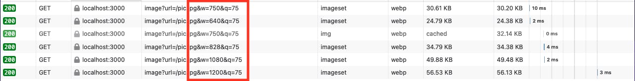
Next.js uses an API to optimize images. As the screen size changes, the image's size also changes according to certain breakpoints. If you don't provide breakpoints explicitly, the default values are these:
module.exports = {
  images: {
    deviceSizes: [640, 750, 828, 1080, 1200, 1920, 2048, 3840],
  },
}
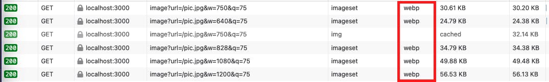
Image format optimization
We've talked about how it is suggested to use Webp format for images when we use them on our sites. Actually, you can also check the Google Lighthouse from the inspector. If the image format is jpg or png, the lighthouse will suggest you use Webp format for better performance.
Next.js handles that too! It changes the image's format to Webp even if it's jpg or png, etc.
Here is the code:
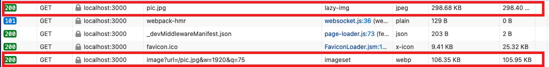
<div className={styles.imgWrapper}>
        <Image src="/pic.jpg" layout="fill" objectFit="cover" />
</div>
Here is the output in the browser:
Here is the comparison of using jpg vs Webp with the same image:
Lazy loading
Remember, we've talked about how it's important to use loading="lazy" attribute to boost our site's performance? This is also automatically done by Next.js Image component. The images won't be rendered until they enter the initial viewport.
Cumulative Layout Shift (CLS)
In order to prevent CLS, the images must have explicit width and height. Open the light house and try it yourself. It will give you a warning like this:
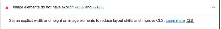
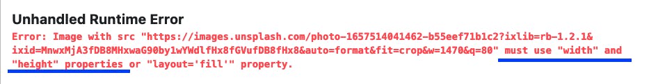
For the local images used in Image component, Next.js automatically provides these values. This fixes the problem. However, for the remote images that we use on our sites, the explicit width and height must be provided. Since Next.js doesn't have access to remote files during the build process. And in fact, it gives you this warning:
That's a wrap

Next.js is very popular for a reason. There are many other benefits to building your web application with this framework. If you are a React developer and you'd like to learn more, I recommend you check their docs. It's very informative and easy to go through.
Thank you for staying this long! If you have any suggestions, feedback, or just want to say "hi" feel free to connect me from Twitter.